Flightsayer
PRODUCT DESIGn | BRANDING
Mobile app design for a NASA-funded company advancing predictive analytics innovation.
Flightsayer (now “Lumo”) uses predictive analytics to track patterns across millions of flights, aiming to help business travelers select flights with the lowest risk of delay and rebook when needed. Though Flightsayer had collected data from millions of flights, they needed help designing the mobile application and marketing site so it would be user-friendly to business travelers.
Flight delays cost the global economy more than $60B annually in increased operating costs and lost productivity. Flightsayer’s predictive analytics give businesses and travelers the power to manage and reduce the impact of flight disruptions. The design challenge was to take the data collected from millions of flights into a user-friendly mobile app experience that helped travelers proactively manage and minimize the impact of flight disruptions, and make actionable decisions when their flight is delayed.
USer WORKFLOWS
What workflows are core to the product?
Flightsayer uses predictive analytics to identify delay patterns across millions of flights to forecast disruptions hours to months out and then delivers delay predictions to their end user. One of the channels they wanted to focus on for delivering this service was through a mobile app - to give business travelers on-the-go real-time information. Because this was a new service, I worked with the client team to hone in on their ideal customer’s pain points and motivations, as well as the value proposition for customers. Pain points and motivations were gathered primarily through one-on-one interviews with the client team.
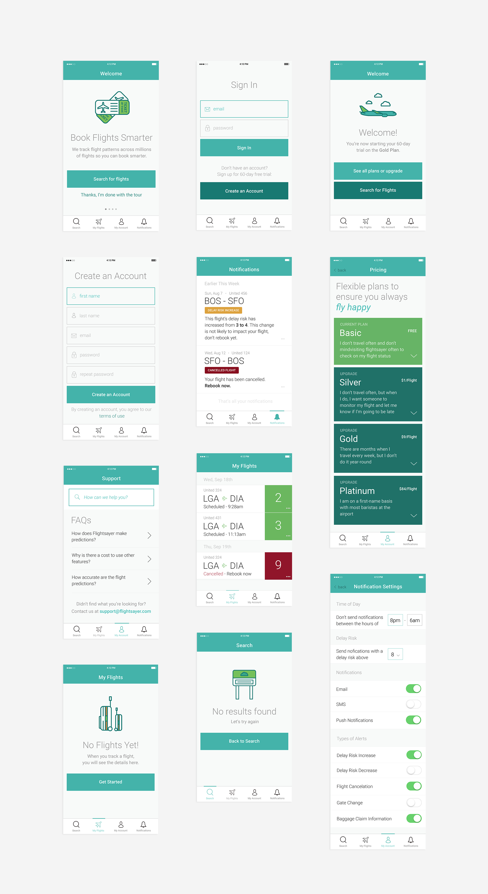
The primary objective of the project was to develop the brand and visual language for the marketing site, as well as the UX and UI for the mobile app. Because this was a reasonably low-budget project, I facilitated a working session with the client team to align on what data would deliver the most value to people in the mobile app experience. During this session we identified four workflows that were core to the product:
My Account - ”I need to sign up for an account to reference and track my flights,” Onboarding - ”I need to know what how the app can help me make better choices during travel,” My Flights - ”I need to track my flights to see how long the delay is, and plan for how it impacts my trip,” and Search - ”I need to search for flights, and want to make sure my flight is on time.”
Initial low-fidelity wireframe sketches.
WIReFRAMES
Using design tools and frameworks to solicit feedback and define features
After identifying the critical user tasks of the mobile application with the client team, I sketched low-fidelity wireframes of information architecture and UX, aligning this architecture with how each step would help fulfill a user completing primary tasks. I used a snapshot of these quick sketches as a tangible representation of some of the conversations we had during the session and outlining the necessary information and workflows of the mobile app.
Using Invision, I used the low-fidelity wireframes to guide the design feedback process from the client and help define the feature set and UX. The client had a development team, so it was essential to work closely with their cross-functional team to develop the strategy and rationale for features.
INFORMATION ARCHITECTURE
Refining the product strategy through rapid prototyping
Low-fidelity whiteboard sketches are great for internal working sessions with the product team, to quickly outline features and key screens so the team can get a high-level view of the product. However, after gathering initial feedback from the client team, I sketched the second round of wireframes with pen and paper, which allowed for more detail and notes that factored in the client’s feedback.
Working in a lower level of fidelity enabled efficient prototyping of workflow and quick pivots to lay the experience foundation before moving to design.
PRODUCT DESIGN APPROACH
Designing the customer experience
For the initial iteration of the brand language, the client wanted a clean and simple look and feel that integrated custom friendly iconography. The design direction for Flightsayer's main marketing site focused on reaching business travelers, so the focus of the mobile app was to create an experience that would support a user's need to rebook when their flight was canceled or delayed. It was essential to refine the brand language and interface so that it looked professional and friendly, but still conveyed the necessary information and user recommendations on mobile.
BRAND LANGUAGE DEVELOPMENT
Designing the marketing site
Through the process of designing the mobile application, this provided a foundation for the core features and value propositions that needed to be highlighted for the customer on the marketing site. I conducted a competitive analysis within the space, collecting relevant examples from sites like Tripit and other mobile applications to influence how to best highlight the value-add to the customer.
Working with the client, we wanted to emphasize that by using the mobile app, the customer would experience fewer delays, fewer missed connections, and be able to book reliable flights. I used proto-personas to guide the information architecture strategy and recommendations for crucial pages that users would arrive on via the client team’s marketing efforts.
THE NEXT FRONTIER
A foundation for growth
Since 2015, when the project began, Flightsayer (now “Lumo”) had gone through a brand evolution, though the information architecture and user experience strategy remains true to the initial recommendations delivered when the project began. Backed by big players such as NASA and JetBlue, I was fortunate to have worked with such a talented team of engineers, predictive analytics experts, and aviation specialists to bring their vision of the product to life, and help with their marketing efforts.
I worked as the lead user experience designer and strategist on this project with support from a digital strategist, working closely with the client team as a consultant throughout a year to help give them a foundation for growth.
Download the mobile app on the apple app store.


